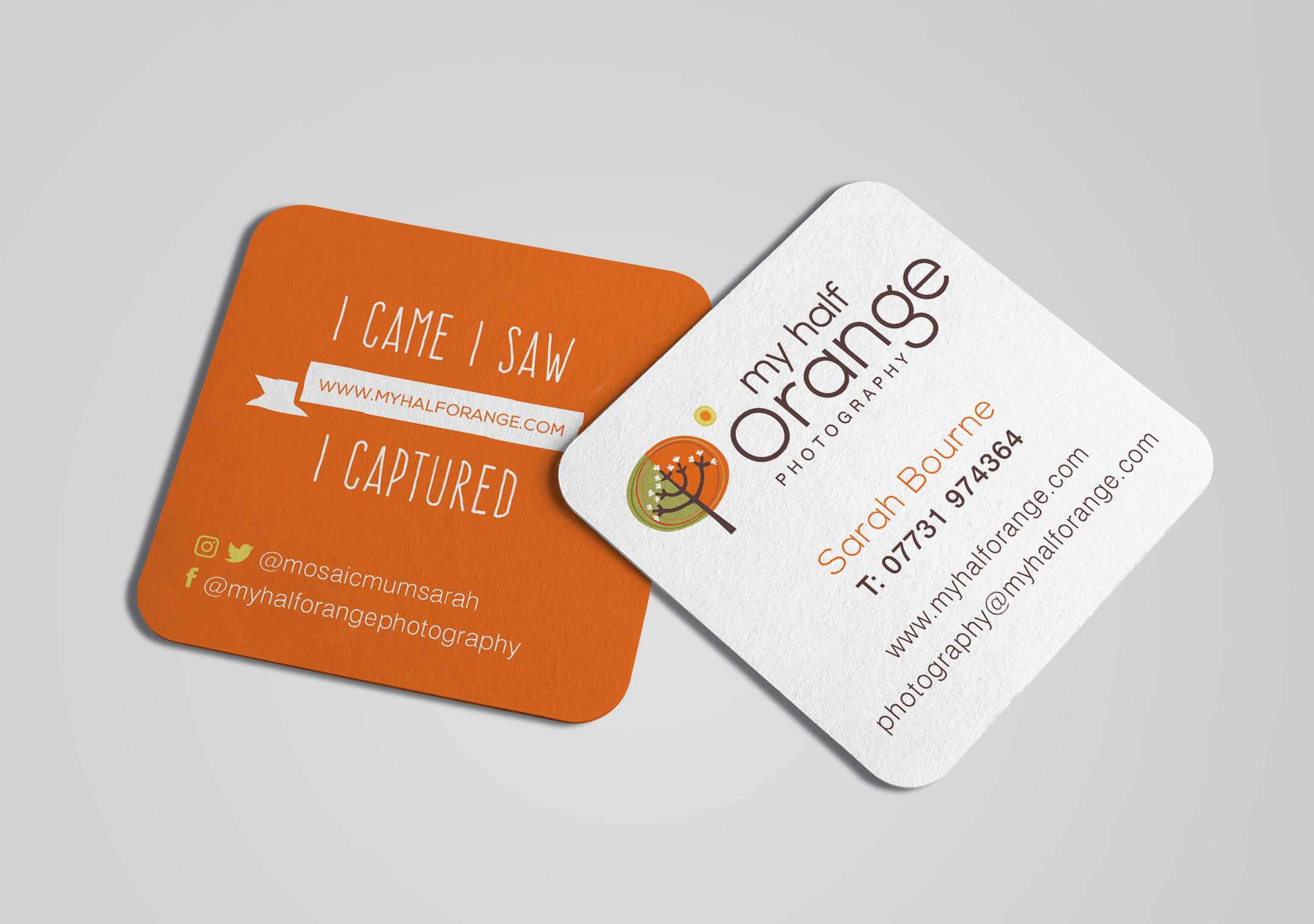
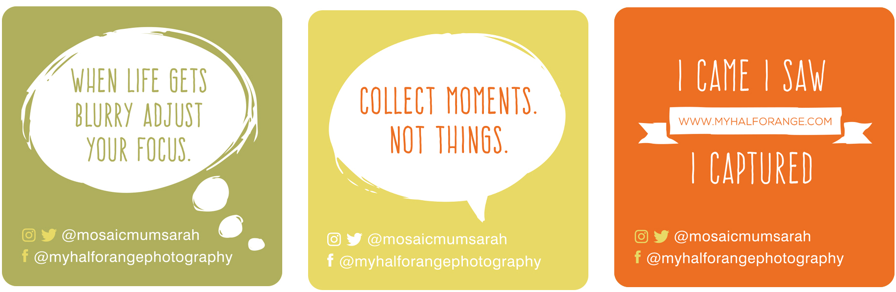
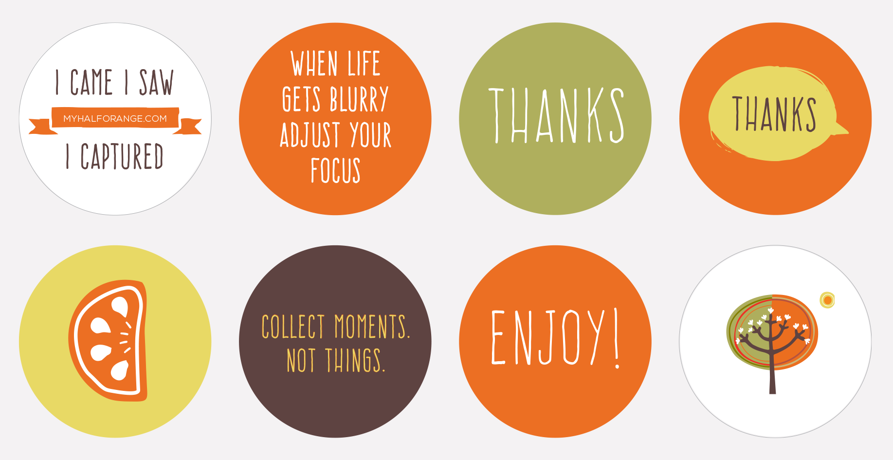
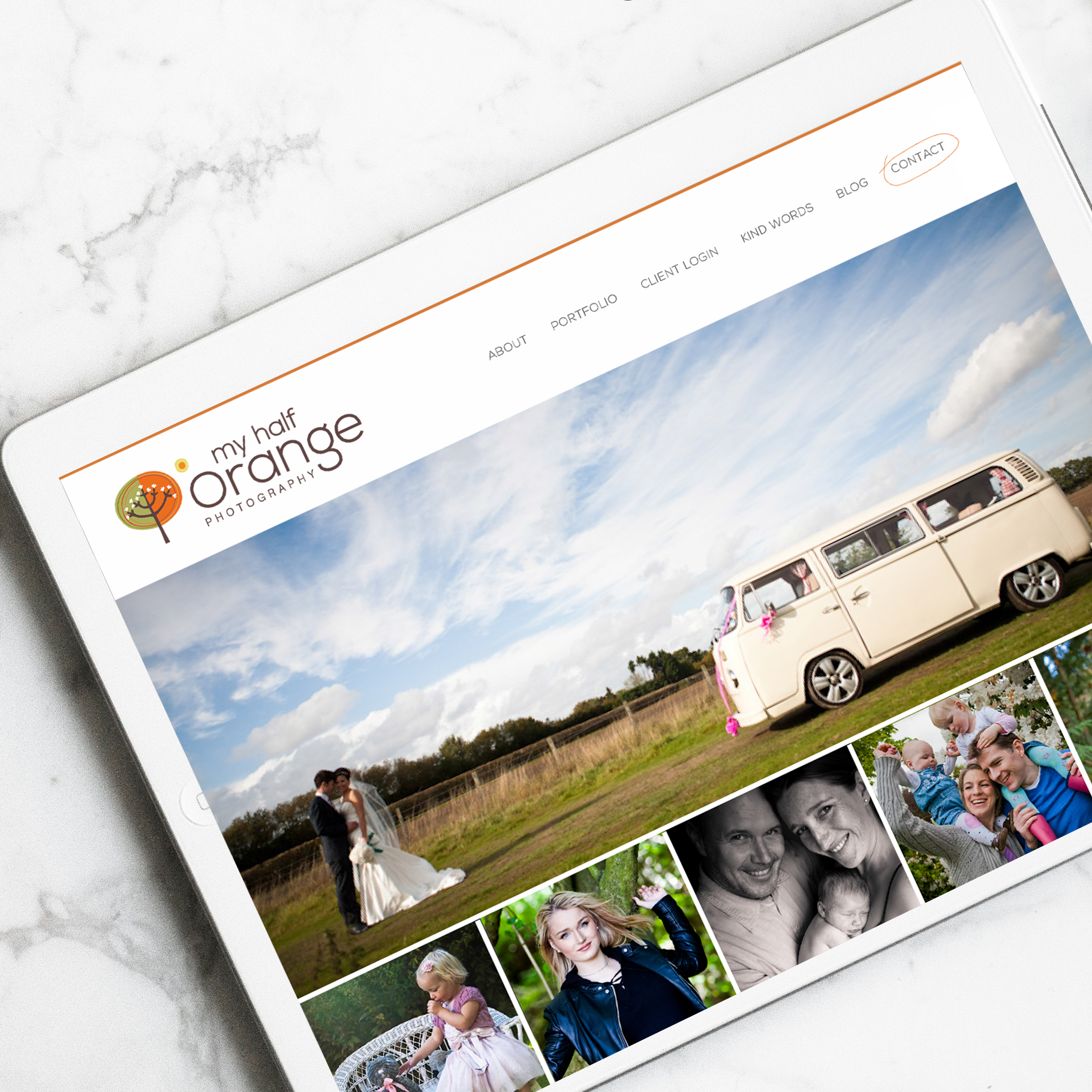
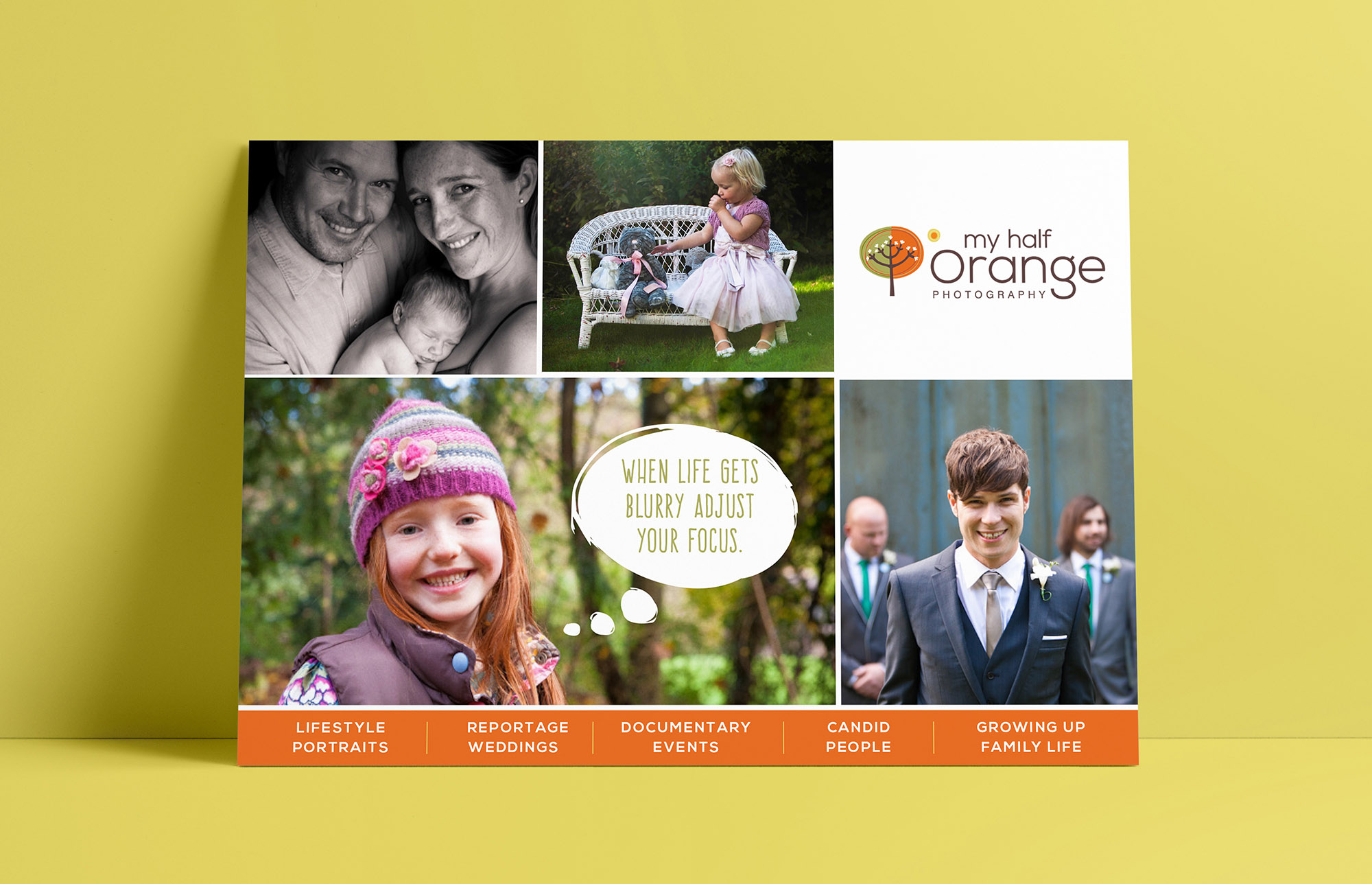
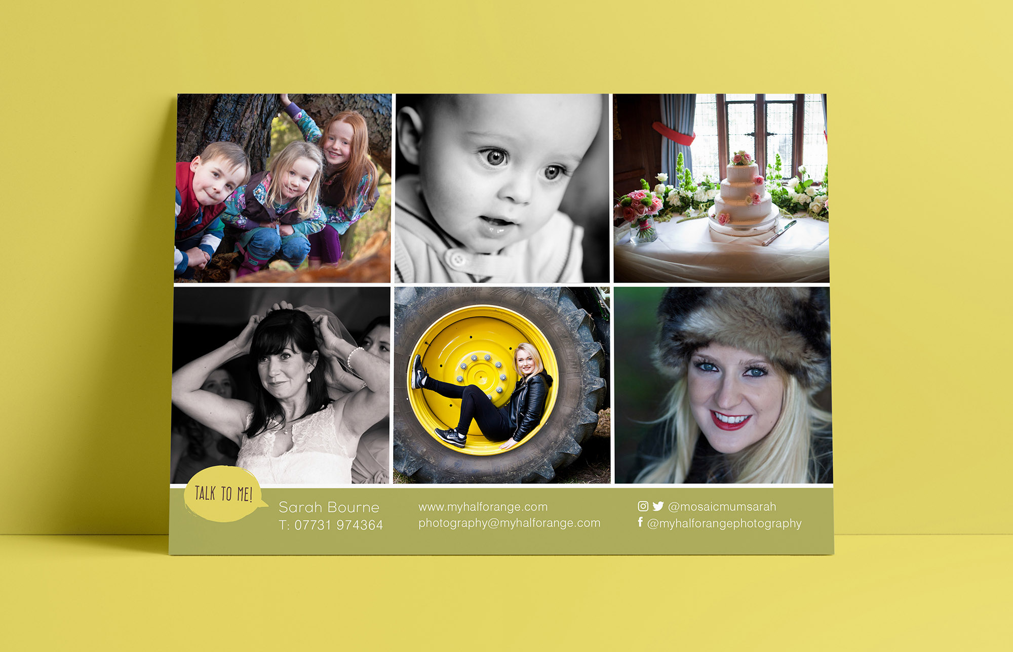
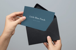
Sarah Bourne embarked on a refresh of her brand, for her photography business. The tree element of the logo remains with minor tweaks but the typography was bought up to date to give it a new lease of life. The brand better symbolises her fun personality and helps to portray her friendly relationship with her clients. I created a graphic language for the brand, using freestyle elements and quirky typography to tie everything together. I designed her print items as well as the website.