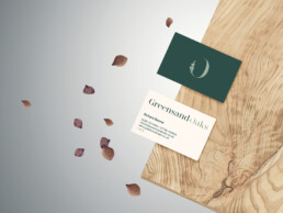
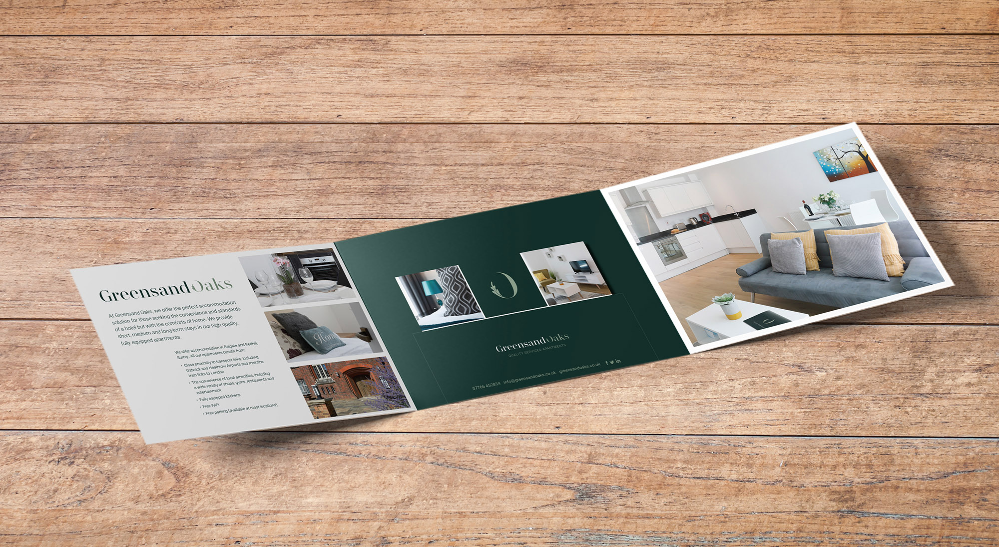
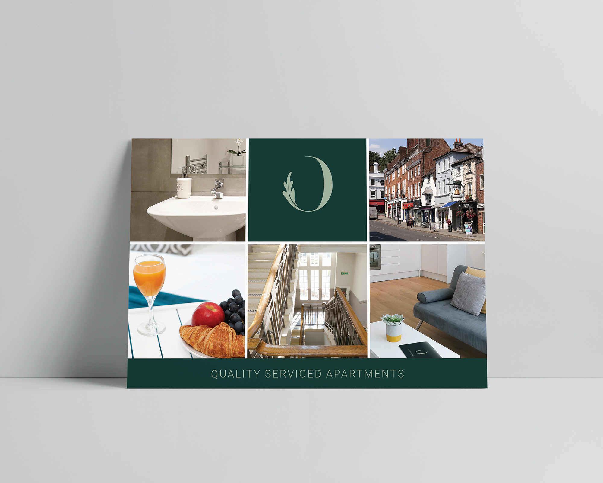
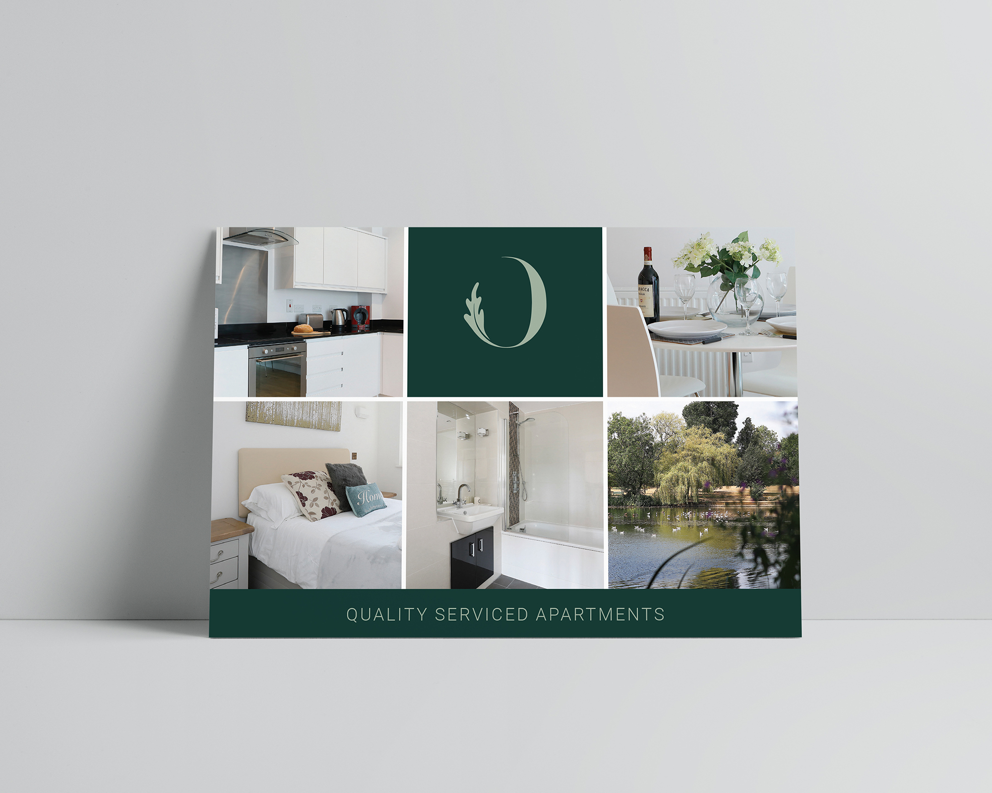
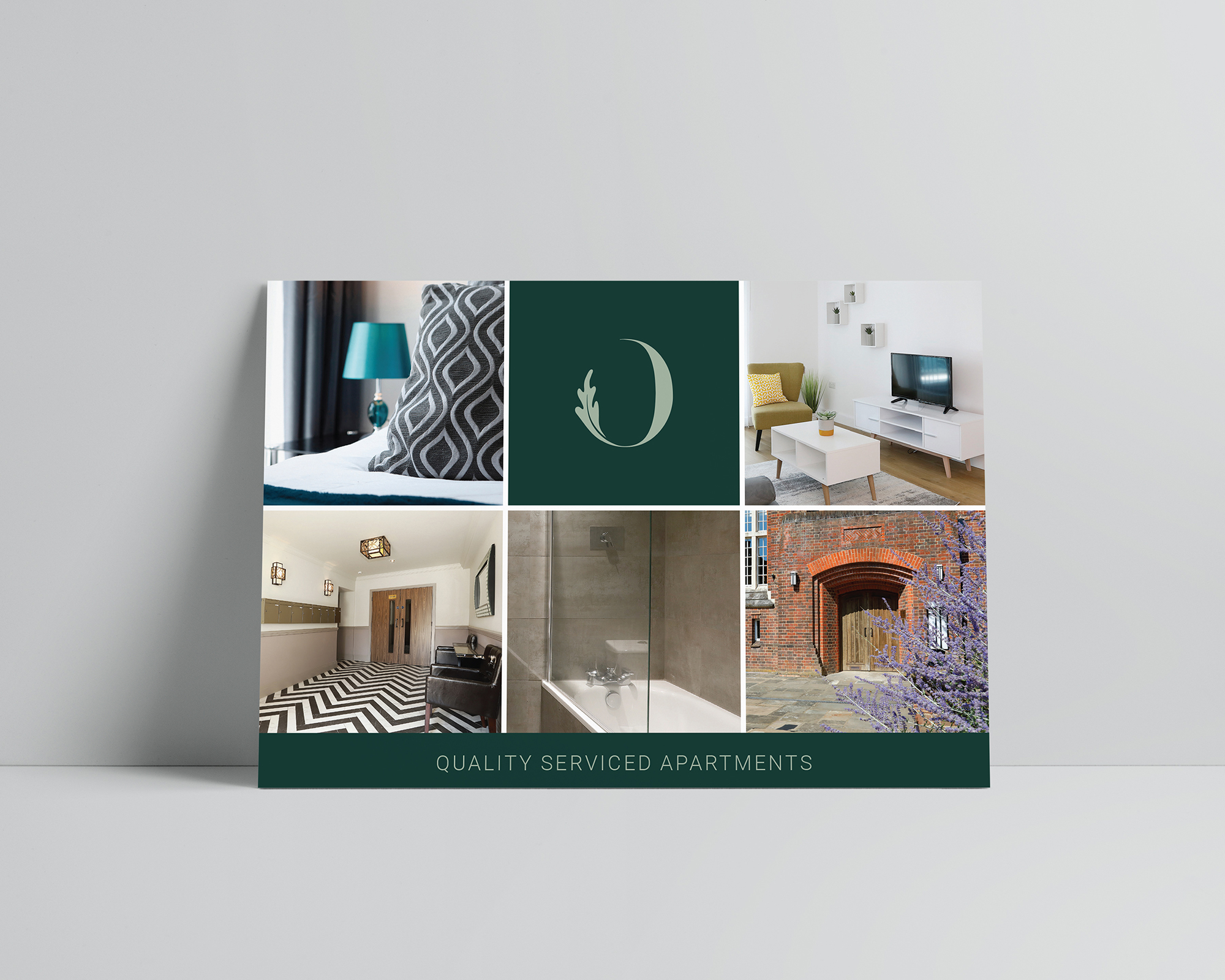
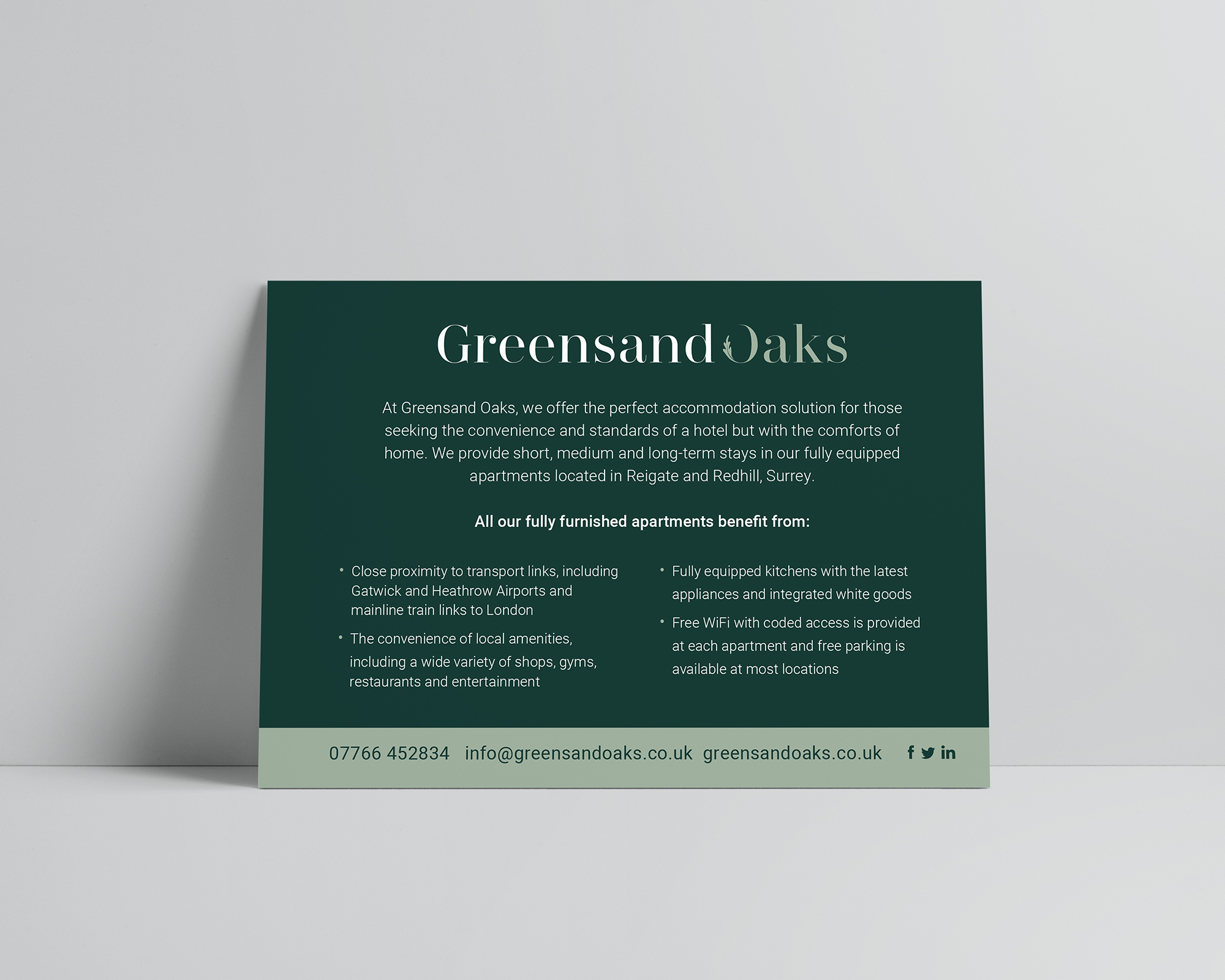
Working with Your Marketing Team I embarked on a project to rebrand Greensand Oaks, a quality serviced apartment letting company. The company name took its origin from the Greensand Way walk across the leafy Surrey hills and the Greensands Tower. The original logo incorporated the tower but had become somewhat dated. The client wanted a fresh more modern approach but wanted to keep the name and natural theme. After research and development of concepts I produced a range of ideas, all incorporating a natural colour scheme and theme. The client chose this route featured, using a strong mark that uses the ‘O’ of Oaks and the oak leaf incorporated; perfect for social media icons, key fobs etc.. The colour scheme feels professional yet modern and styling is simple and elegant, we opted for a soft touch varnish on printed items.